The Dallas Morning News did an otherwise fine job of presenting some facts, figures, and graphics that reveal just how misguided it is to reopen everything and send the message to citizens that we’ve got the pandemic sufficiently managed to go to Supercuts. But one line graph caught my attention. Have a look:
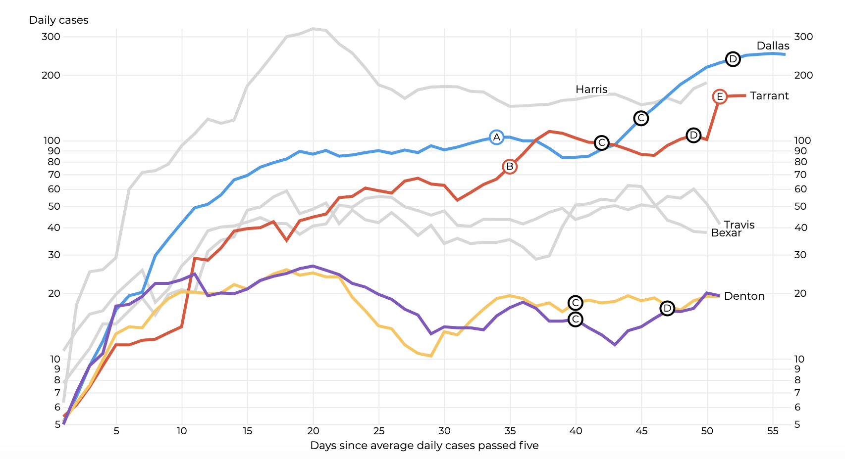
I saw that sucker and thought, “Well, OK, that’s not looking all that bad. Yeah, Dallas County took a bit of an uptick there on the right, but overall — wait, what the Fauci is going on here?” Look at that Y axis. Do you see the problem? The first two-thirds of it gets you to 100 daily cases. The last third, at the top, takes you to another 200. This graph should be much taller than it is. By compressing the top of the Y axis, the folks at the DMN have erroneously flattened the curve, creating the impression that we are faring far better than we actually are. This is dangerous.
By the way, I’m guessing they did this so the graph would fit more neatly on the page (or screen). That’s lazy and irresponsible. I hereby request that the DMN redraw this graph so that it reflects reality.
UPDATE (2:45) Showed my ass here a bit, didn’t I? [rolls up pant legs] Let’s wade in to how I screwed this up and why I still think that graph doesn’t work in the DMN:
First and foremost, the DMN with this graph was not being lazy or irresponsible. I was wrong to say that, and I apologize. I certainly earned all the ridicule I’ve gotten on Twitter. The graph still winds me up, though.
I know I goofed here. I saw the graph, didn’t understand that the Y axis was logarithmic, and fired off this post. But you’ll have to trust me when I say that I understand what an exponential function is and that a logarithmic function is the inverse. I had to spend some time thinking about why you’d want to use a logarithmic graph in this case. If you’re wondering about it, watch this Financial Times video, just the first part. It’ll take you about two minutes.
OK, here’s the part that gets me. Not long ago, the paper was running its reporters’ copy through a filter in their software that pushed them, essentially, to write at an eighth-grade level. (I asked someone at the paper. They weren’t sure when this practice stopped, but it has.) But we’re cool with logarithmic line graphs? How can the average reader be expected to understand what’s happening here?
Here’s what a linear graph of this same data looks like. It makes more intuitive sense to me.
Here you go. A problem with this graph is is that t hides significant percentage variability on the lower scales (like Collin and Denton counties). pic.twitter.com/7FM5zMDCsI
— Dallas 🏕️ (@1DalM) May 13, 2020
Anyway. My shovel just hit Wuhan. I should probably stop here.
Except to say once again that I’m sorry, especially to John Hancock, data and interactive design editor at the DMN (John Hancock!), and to thank the folks in the comments of this post who pointed out my mistake without hitting me with the brickbats I deserved.